What Is Color Theory in Interior Design?
Color theory in interior design is both the science and art of using color. Color is a universal visual language that influences how a space feels and how people respond emotionally to it. The colors used in home and office interiors can alter a person’s mood, evoke happiness or calmness, or even create feelings of energy or seriousness.
Understanding color theory is essential for creating functional and beautiful spaces, which is why professional interior design services focus strongly on color planning.
Choosing appropriate colors for interior spaces is an important aspect of design. Color can make or break a space, and when used wisely, it helps create the intended atmosphere that reflects the personality and lifestyle of the people living in it.
Even so, most people don’t spend a lot of time thinking about the effects of color in their homes or offices. Yet, the color and design of a space should work together to create comfort, balance, and harmony.
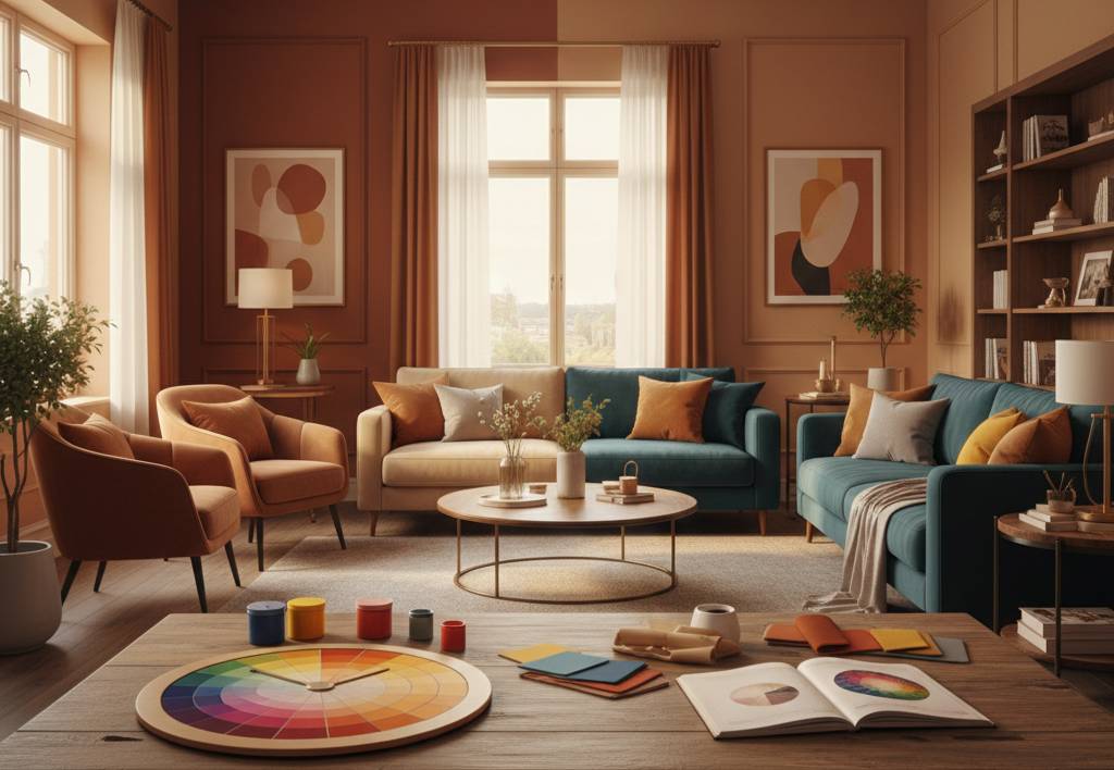
Basics of Color Theory you need to know
Understanding the basics of color theory helps homeowners and designers choose the right color combinations. Colors behave differently when placed together, and each combination creates a unique visual and emotional impact.
Complementary Colors – Complementary colors are colors or hues that are directly opposite each other on the color wheel, such as blue and orange or yellow and violet. These color combinations create strong contrast and visual interest.
In interior design, complementary colors are usually used as accent colors in small quantities. When balanced properly, they add vibrancy without overwhelming the room.
Triadic Color Schemes- Triadic color schemes form a triangle on the color wheel, such as yellow, blue, and red, or orange, green, and violet. These colors offer high contrast while maintaining balance.
Triadic colors can be used as accent colors, but they must be carefully balanced. If used excessively, they can overwhelm a space and disrupt visual harmony.
Analogous Color Schemes – Analogous colors are groups of colors that sit next to each other on the color wheel, such as red, orange, and red-orange. These combinations are pleasing to the eye and create a smooth, comfortable look.
Analogous color schemes work well in spaces where a calm and coordinated appearance is desired.
Monochromatic Colors – A monochromatic color scheme uses only one color in varying shades, tones, and intensities. For example, navy blue paired with lighter powder blue shades.
This approach creates a clean, elegant, and cohesive look while keeping the design simple and sophisticated.
Cool and Warm Colors – Warm and cool colors are used to create specific moods in interior spaces. Warm colors include reds, oranges, yellows, and pinks, while cool colors consist of blues, greens, and purples.
Warm colors are often used in social areas like living and dining rooms, while cool colors are ideal for bedrooms and relaxation spaces.
Non-Colors – Non-colors aren’t found on the color wheel, but still play a very important role in interior design. Non-colors are the greys, beiges, browns, whites, and black.

Color can alter a person’s mood, incite anger, evoke happiness, or call to mind feelings of indifference and sadness. Color can make or break a space. Choosing appropriate colors for a facility’s spaces is an important aspect of interior design.
Even so, most people don’t spend a lot of time thinking about the effects of color in their homes or offices. Yet, the color and design in our home should reflect the people who live inside, and designers and homeowners should use colors wisely to create the intended atmosphere in each space.

Color is a universal visual language comprehended by all, so when you’re attempting to impart or transmit something through the interior plan, there’s no preferred method to do it over than through color. With a specific end goal to do that, you have to see how colors act, how they change their character, and how they impact our mood.
How do Colors impact our mood?

While picking floor or wall colors, it’s vital to remember the objective of the space. If enthusiastic work is being performed in a space, exciting and cheerful tones may be considered.
While choosing a shading palette for a room, there are a few components to take into consideration. Most importantly, practicality is essential. If you have pets or kids, avoid white and different hues that are hard to take care.
The colors you select should either organize or differentiate. So choose whether you need the stylistic layout to be agreeable and relaxing or exciting and dynamic. Be careful while picking the tones and shades.

The colors you use in your interior design and stylistic theme influence the atmosphere you create, and you have to effectively survey what this atmosphere should be before you pick the colors.
Color theory is important to interior design. Not only does it impact human feelings, but it is likewise the fastest method to instantly change a room. A layer of paint can significantly change interiors, disguise outline issues, and different deformities. An environment can become understimulated or overstimulated, depending on the colors used. An understimulated environment features weak intensities of color and weak or monotonous color contrasts, while an overstimulated setting features highly saturated colors, strong contrasts, and/or too many complex visual patterns.
 5")
 6")